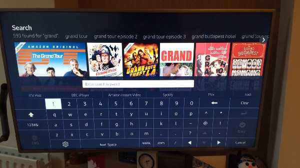
The state of TV on-screen keyboards
A study of TV keyboards, qwerty, search and everything in between
- Published
- Words
- 2224
- Reading time
- 8 minutes
The 1870s. A decade that saw the death of Charles Dickens (1870) and the birth of Albert Einstein (1879); the patent for the first commercial light bulb (1879); Lewis Carroll publish Through the Looking-Glass (1871). And tophats, canes & bustles were _en vouge._
A lot has happened since the 1870s. As it turns out, 140 years is a really long time. However, some things have stayed the same. One such thing is the keyboard layout: we’re still using a keyboard layout that was invented for a physical device over 140 years ago.
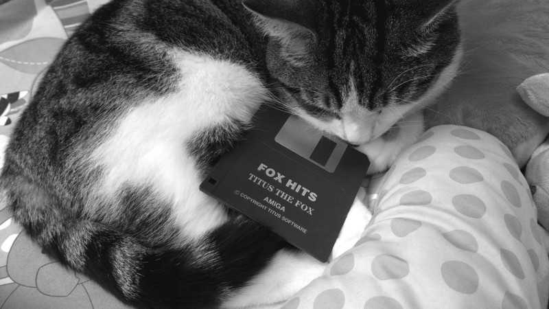
And rightly so, familiarity (and social intertia) is worth a lot — everyone (even your Gran) knows how to use a qwerty keyboard and we learn it from a young age. Familiarity is why we still use a floppy disc icon for ‘save’ for example: ever seen a USB stick or an SD card icon? No, didn’t think so. But children know what that icons means even thought most will have never actually seen one:
This familiarity has meant that we’ve adapted that layout from typewriters to PCs to touch screens to TVs and now even to virtual reality. But as you’ll see if you keep reading, there’s a whole mixture of implementations of TV keyboards: there’s a split of either A-Z or qwerty layouts. However, it’s not just the keyboard layout itself but the supporting functionality for the user’s goal, that makes or breaks the experience. Like search results as you type; pressing left/right to loop back to the end/start of the keyboard row; or having 2 space bar buttons to minimise button presses. But more on that later.
So here it is, an exploration into on-screen TV keyboards…
The state of things
There’s a lot to consider with the modern keyboard layout, especially for TVs. For example, there’s:
- screen sizes — everything from 32 and under all the way to 65 inch plus and TVs are getting bigger all the time.
- processor speed — at the time of writing, Currys had 103 quad core TVs for sale, 18 dual core and 36 single core.
- operating systems — like Tizen on Samsung, webOS on LG, Firefox on Panasonic and Android on Sony to name but a few
- input methods — there’s the regular remote with arrow buttons, but also the 4 coloured buttons, gesture remotes like LG’s Magic Remote and companion apps…
- companion apps — using your phone or tablet to ‘cast’ to your TV
As a result, and without a clear standard way of doing things, there’s a vast difference in the way on-screen keyboards are implemented and the experience that goes with it.
What is that experience?
It’s usually either search or login. Search, if done right, can be a fast alternative to browsing for content. Logging in, although usually done only once or very infrequently, can be tricky to type your email address/username and password . For example my email address is 26 characters long and if you’ve got a secure password of say at least 10 characters — that’s a lot of typing.
So here’s a quick review of a few popular TV services, their keyboards and search experiences, with a really arbitrary rating out of 5:
YouTube (4 / 5)
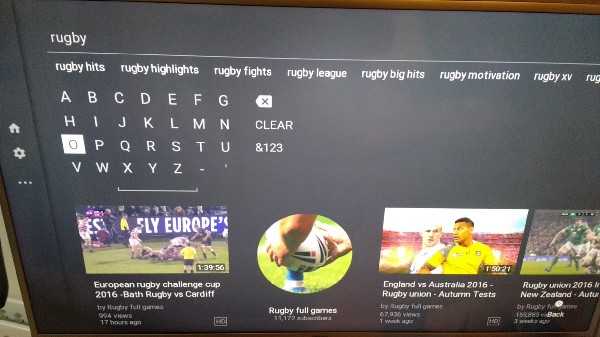 On screen keyboard for YouTube
YouTube probably has the most difficult job of all the apps listed here. The sheer number of videos they serve means searches have to be precise to get the correct terms and results. However it works well and the results are clearly labeled with useful metadata such as number of results and upload date.
It features:
- A-Z layout, 7x4
- left/right keyboard wrap around
- numbers on a separate screen
- search history
- term suggestions above
- video suggestions below
- video metadata with image
- results as you type
The real bonus for YouTube though is the ability to use your phone and cast so you don’t even need a TV keyboard.
Netflix (3 / 5)
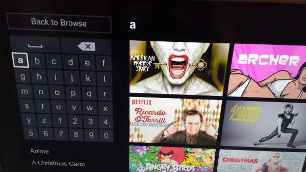 On screen keyboard for Netflix
Netflix’s keyboard is square A-Z layout with numbers included so no need to navigate to a separate numeric keyboard. Although it features results as you type, it’s a hybrid of results to the right and terms below. Some of the terms are categories and some are direct results. But some of the direct results confusingly yield no actual content (see below).
It features:
- A-Z layout, 6x6
- Numbers included
- No wrap around left/right OR up/down
- Results as you type
- Results to the right with image
- Further terms below
- No search history
The keyboard and search generally work well but there’s one major frustration — if you search for something that isn’t available, it taunts you. it will show you the term but the content will be “titles related to X".
BBC iPlayer (3 / 5)
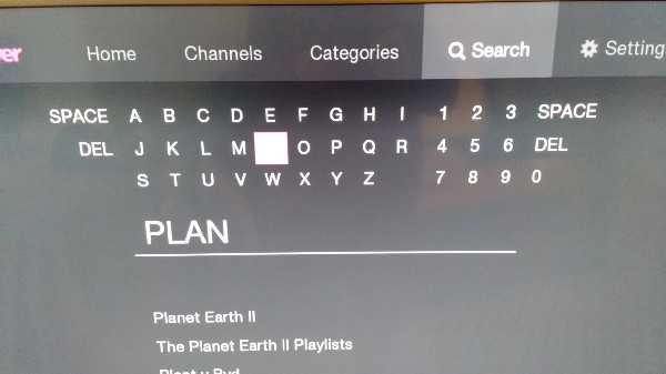 On screen keyboard for BBC iPlayer
As you’d expect, BBC’s offering is well thought out and easy to use. The keyboard could be more square to avoid extra button presses but at least you can wrap around left/right and the inclusion of space/delete at either end is a nice addition. The results are simply titles of the shows, which could benefit from some metadata like number of episodes etc. Because of a smaller quantity of programmes there’s no need for term suggestions as well as direct results.
It features:
- A-Z, 12x3
- numbers included by default
- wrap around left/right
- results as you type
- simple title results
- duplicated space and delete buttons
- no history
All 4 (3 / 5)
All 4’s offering is fairly similar to the BBC’s. Although you can’t wrap around in either direction, the square layout means fewer button presses anyway. The results appear as you type, which renders the ‘search’ button fairly useless, but the results are simple show titles and easy to select:
It features:
- A-Z, 6x6
- numbers on a separate keyboard
- no wrap around
- results as you type
- simple title results
- no history
ITV Hub (2 / 5)
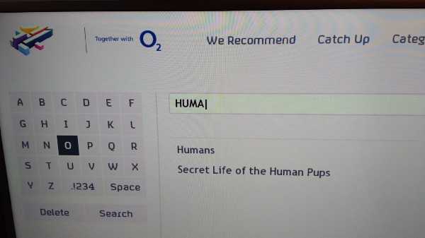
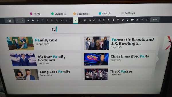 ITV Hub keyboard — poor linear design
ITV’s offering is poor as a result of the linear A-Z keyboard, making it slow to type. At least the results appear quickly as you type and it’s redeemed by use of the blue shortcut button to get to the search page and the fact that there’s not that much content so you generally only need to type a couple of letters before your result appears. The results also give you a title, image and number of episodes.
It features:
- A-Z, linear
- High contrast
- Wrap around left/right
- Results as you type
- Results with title, image and number of episodes
- No history
Amazon Prime Video (4 / 5)
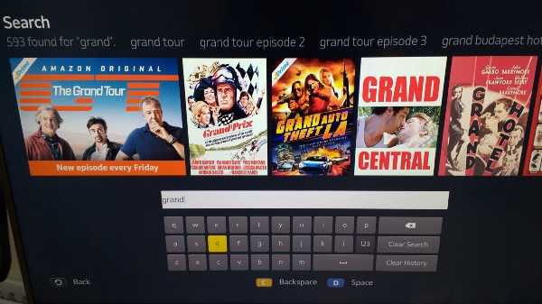
Our first qwerty layout! Amazon’s search generally works well, the use of qwerty is familiar and clear & easy to use. Shortcuts for space/backspace are welcome and the only app here that makes use of them for this purpose. The results are clear and appear as you type and there are term suggestions too.
It features:
- qwerty
- results as you type
- results and term suggestions
- coloured button shortcuts for backspace/space
- search history
Samsung Smart TV (4.5 / 5)
Samsung’s on screen keyboard is the best here. It makes full use of the screen width, is familiar qwerty. uses high contrast for active states, includes numbers by default. but it’s trump card is its predictive input — the only keyboard here. Pressing a letter throws up the 4 most common next letters as suggestions. This makes typing a breeze and minimizes number of button presses.
It features:
- qwerty layout
- high contrast
- full screen width
- numbers visible by default
- predictive text
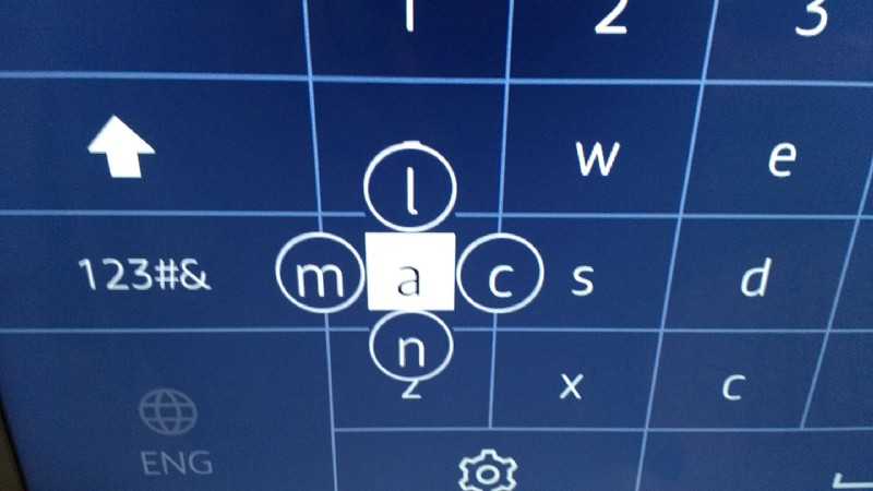 Predictive input with Samsung Smart TV
Feature roundup
There’s a lot of features on show here and some that are probably missing. They’re detailed below but you’ll see a theme — most of them are aimed at reducing the number of button presses to type characters or navigate, symptomatic of the limited interface (remote) available on TVs.
Colour buttons
There are 4 coloured buttons on TV remotes that can be used to aid navigation above the default 4 arrow buttons. There were no apps reviewed here that used them on a search/login screen and only ITV that used colour buttons at all to navigate between sections of the app: home, categories etc.
The colour buttons could be used to augment the experience for common actions, for example something like:
- red: space
- green: delete
- yellow: login or jump to results
- blue: swap to number keyboard
Companion app
YouTube is the only app here that allows you cast from a device to the TV, which works well and means typing doesn’t have to be done via the TV remote. I’m surprised more applications haven’t adopted this functionality.
Looping
Being able to loop from left round to right and vice-versa (or up/down) can drastically reduce the number of button presses to get to the correct character.
Duplicate keys
iPlayer uses this with a space/delete key on either side of the keyboard. Duplicate common keys like done/space/delete/@ can reduce total key presses.
Accessibility
It’s not something covered here, but TV keyboards should follow accessibility guidelines so things like minimum of 4.5:1 colour contrast, not using colour as the only way of conveying information. Actually, I’ve no idea if TV interfaces are covered by WCAG but if not, they should be.
Full width
TV screens are big! Let’s make use of the space, which leads us on to…
Visible numbers
If there’s screen space then why not use it to display the numbers by default? It’s about half and half in the apps reviewed here as to whether numbers were displayed. The benefits of visible numbers by default does depend on both the content available and type of keyboard though.
Login keyboards with an email address/password are fairly likely to need a number character somewhere along the line. For search perspective, it depends on the quantity and programmes available. On iPlayer, for example, out of 1227 programme titles (as of 13/03/17), only:
- 14 start with a number
- 26 others contain a number somewhere in the title
- 24 of that 26 are the start of a word e.g. ‘1990s’, ‘2016’, ‘21st’ etc
So that’s only 3.25% of programmes on BBC iPlayer containing numbers. I don’t know about the popularity of those programmes/search frequency, but you might be happy with only ~3% of your users needing an extra button press to show a separate numeric keyboard. Or you might not.
Search: predictive letters
The keyboard on the Samsung Smart TV itself was the only one here that exhibited this feature. It drastically reduced typing and number of button presses. Win!
This is different from term/results as you type (see below) and uses next letter suggestions requiring just 2 button press: direction and enter. It’s more useful when there’s huge amounts of content on offer, ie when it takes more typing to get the content you’re after.
Search: results as you type
All the examples above show results and term suggestions as you type — no need for the extra presses to hit a ‘search’ button.
Search: history
If you’ve searched before, then there’s a chance you might want to view the same content again. Before you’ve started typing, they’ll be plenty of screen space to show history which can then disappear as you type.
Search: Popular searches
Much like on an app homepage that shows common, trending or popular content, the same can be done with search terms. This can be used as an alternative to, or to supplement, search history. None of the examples above used this.
Search: Both results and term suggestions
This depends on the amount of content but YouTube does it well showing both term and result suggestions.
Search: results with metadata
There’s some useful metadata that can shown on results, things like:
- time left before it expires
- number of episodes
- last episode released
- duration
- number of views
- number I haven’t watched (personalisation)
Login: common email address domains
Adding common email address domains like hotmail.com, gmail.com etc alongside the login keyboard reduces key presses for a large proportion of users. See List of Popular Domains for a good starter list.
Login: @ symbol
Similar to the one above, adding the @ symbol (and duplicating it on either side of the keyboard) can reduce key presses.
Taking this forward…
So there we have it. A review of the status quo of TV keyboards and round up of features.
Who knows, maybe there’s scope for building an ‘Open Keyboard’ companion app for devices that pairs up to your TV so we don’t even need on-screen keyboards?
But as it stands, I think there’s room for improvements across TV keyboards in general and I’d love to see the likes of BBC, ITV etc pick up on some of the points in this article.
A note of caution though: I’m not recommending that ALL the features combined together makes a great TV keyboard experience. In fact that would probably make for a confusing UI — take what you need that’s relevant to your user. After all…
It’s all about your users.
