Five important things I’ve learnt about accessibility
Not your usual accessibility how-to article
- Published
- Words
- 1800
- Reading time
- 7 minutes
There are a lot of great articles out there about accessibility. You can easily read about writing alt attributes, colour contrast, why disabled buttons are bad and other specifics.
But this is not another how-to article.
This is me trying to share some of my experience about accessibility and inclusive design & development. I’m no expert by any means (and before you point it out in the comments, yes I know my portfolio isn’t 100% accessible). But I’ve enjoyed learning about accessibility, compiling this post and sharing it with my team. And I wish I’d known some of these when first learning about accessibility. I hope you find it useful.
Please let me know what you think in the comments below or contribute to my accessibility resources on GitHub.
1) You benefit. I benefit.
That old accessibility myth:
“accessibility is just for people with disabilities".
Wrong.
Yes, of course we’re primarily targeting disabled people when building accessible applications:
- Around 15% of the world’s population lives with some form of disability (WHO World report on disability)
- 8.5% of the population has a disability that affects computer use (WebAIM)
- 4.5% are affected by colour blindness (Colour Blind Awareness).
But it benefits everyone, you and me included.
I’ve come across people just thinking in terms of visually impaired users and screen readers when it comes to accessibility. And whilst that’s definitely a key consideration of building for the web, that’s only one user group out of many who can benefit.
When you start to think beyond just assistive technology and disabled users that you start to unlock the potential and benefits of designing for everyone.
This is where it really helps to think about Inclusive Design as a method, rather than simply accessibility. That is, design and build inclusively for everyone, no matter what their ability, disability or situation. So for me, this goes beyond just following a spec, more on that later.
Consider the following:
- You’re in the car. You’ll be glad of voice commands, large buttons on your sat-nav, clearly laid out menus, succinct descriptions and steering wheel buttons.
- You forget your glasses. You’ll be glad of easy to read text, good contrast, and zoomable content.
- You’re a new parent. You’ll be glad of ̶s̶o̶m̶e̶ ̶s̶l̶e̶e̶p̶ anything you can operate one handed.
- You’re on the train without your headphones. You’ll be glad of subtitles for videos when you’re scrolling through videos on your Facebook timeline. (Let’s hope they don’t autoplay though).
These are known as situational (in the car) or temporary (forgotten glasses) disability. The first time I really came across the idea of situational or temporary disability was in the Microsoft Inclusive Design Manual. Which, by the way, is a great easy-to-read resource — I’d definitely recommend reading it and sharing it with your team.
Aside from situational and temporary disabilities, humans also have a natural spectrum of ability. It’s appreciating and understanding this that gives us the empathy to design inclusively. After all, it’s our job as professional designers and developers to build experiences for everyone.
“it’s our job as professional designers and developers to build experiences for everyone"
2) Try assistive technologies
How many designers and developers have actually tried using assistive technologies?
Not enough!
I certainly hadn’t a few years ago even though I knew some basics about accessibility. It wasn’t until I tried using some that I started to understand and appreciate why we were using certain techniques. I like to think this empathy and appreciation has made be a better developer. I’ll give you some examples:
Semantic heading structure
I knew about using semantic markup and heading structures in HTML. I’d come across it in WCAG 2.0 (1.3.1):
Information, structure, and relationships conveyed through presentation can be programmatically determined or are available in text.
And if you run a webpage through WebAIM Wave, it’ll tell you:
Headings provide document structure and facilitate keyboard navigation by users of assistive technology
But when I used a screen reader on a long web page that I fully appreciated why.
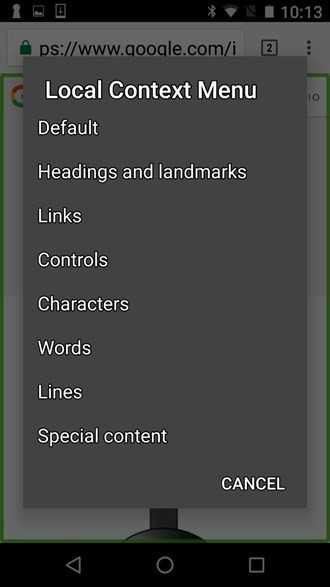
Visually scanning over a page to build up a mental map of the content is something we take for granted with sighted users. It all allows skipping straight to the relevant content rather than reading through paragraph by paragraph. With a screen reader though, it’s even more important to have properly marked up headings and other structures to be able to scan over a document. Take TalkBack on Android for example, you can choose “headings and landmarks" to swipe through headings within a document:
‘Click here’
Point 2.4.4 — Link Purpose (In Context) in WCAG 2.0 says:
The purpose of each link can be determined from the link text alone…
If I said to you, “read more" you’d say “read more of what?".
This is what it’s like navigating to a link like this with a screen reader. This makes it is impossible to understand where the link actually goes. Something you take for granted if you’re able to see the link visually in context. For example, “read more" beneath a title and image snippet for a news article.
Form validation messages
The other two examples above are both around screen readers so here’s a screen magnifier one.
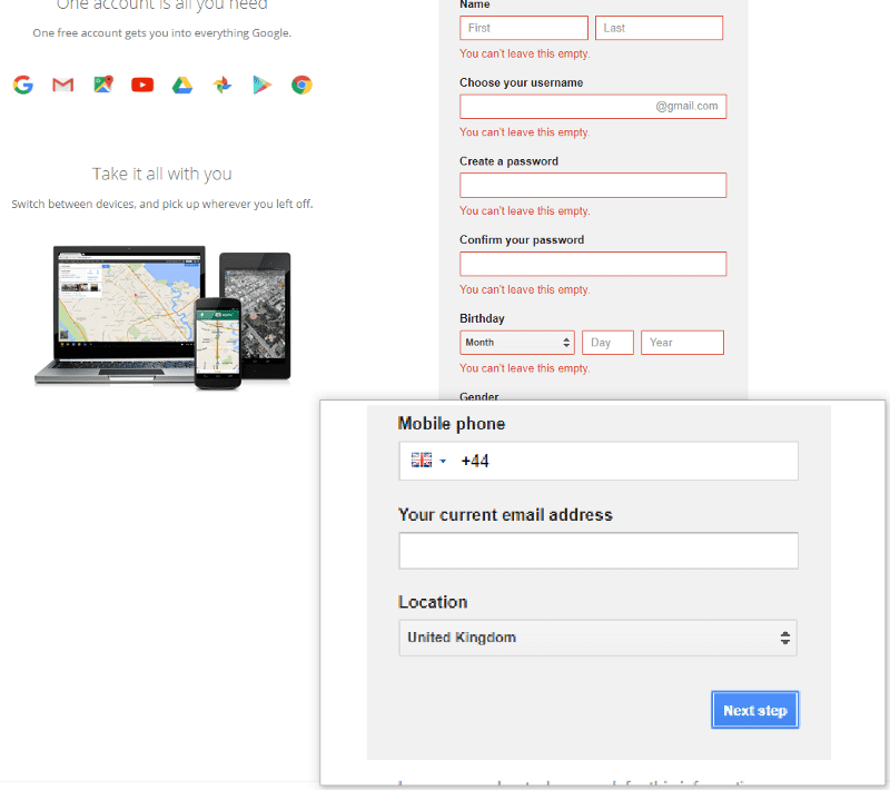
It’s fairly standard for form validation error messages to appear at the top of a form. This makes it tricky to see the message, or even know it’s there, if you’re using a screen magnifier and are focused on the submit button at the bottom of the form.
Try using a screen magnifier when filling in a form. If a validation message appears at the top of the screen, it might push the form down. But the message won’t appear next to the button you just pressed so it can be tricky to see what’s going on.
It might be better to put an error message next to the button as well as at the top of the form.
3) Education is key
I mean educating everyone, not just the technical team. A lot of accessibility articles are targeted at developers & UX designers and a few at content designers. But there are very few article targeted at leadership and management about the benefits.
Take A Developer’s Guide to Better Accessibility. In this article they describe the 6 roles within a team needed to deliver accessible products:
For a digital product to successfully become an accessible product, all members of the team must be committed to accessibility in their roles.
And I totally agree.
It’s great if you’ve got, say, a front-end developer pushing for more focus around accessibility (I’ve been that guy!). But that will only get you so far. You need the whole team, top-down to be educated and committed. Otherwise you end up fighting an uphill battle on your own.
I find this is often one of the hardest things about accessibility. To get there might need a change in team mindset, some organisational change, or even personnel change! I’ve compiled a few articles on accessibility culture which might help you out.
If you do nail it though, it will mean you’ll bake it accessibility from the get-go and it won’t be an afterthought. After all, you can’t just push the berries in afterwards:
4) Don’t rely on WCAG
Not just because there are too many acronyms. I mean if WCAG AA published by the WAI of the W3C isn’t confusing then I don’t know what is.
Don’t get me wrong, accessibility guidelines are great and if you follow AA to the letter you’re probably a long way on the road to having an accessible site. And I mean really following the guidelines, not just running a page or 2 through Wave and claiming you’re compliant.
But the guidelines aren’t a silver bullet.
As Jared Smith, Associate Director of WebAIM, puts it:
Your site can be technically accessible, yet functionally inaccessible
It’s like learning to drive a car. You can learn to use the pedals, gear change, when to look in your mirrors and manoeuvres. This’ll help you tick the boxes to pass the test but that doesn’t necessarily make you a good driver.
Two interesting examples to demonstrate this are the BBC and GOV.UK. They don’t use A/AA/AAA, accessibility sprints or auditing. That’s because they build with accessibility in from the start (again, you can’t just push the berries in afterwards). Take this slide from BBC UX&D for example:
And secondly, GDS go even further and don’t even have an accessibility statement:
The website doesn’t have a separate accessibility statement. This is because we’ve tried to design GOV.UK to be as accessible and usable as possible for every user.
This just shows that it’s more important to have an accessible experience for everyone, rather than just meet a spec. In fact, the service manual articulates this quite well:
Accessibility is more than checking the boxes of standards compliance — GDS Service Manual.
5) So much tooling!
How many times have you heard “it’s hard" or it “takes longer" or “costs more" to be accessible?
These aren’t good enough excuses.
There are a lot of tools out there to help us along the way. I was surprised by just how much when I compiled the list. Let’s look at some examples. There are tools like:
- checkers like WAVE and HTML_CodeSniffer
- colour contrast tools like Color Safe and Contrast ratio
- writing tools like Hemingway and Readable
- test automation like aXe and Pa11y
- checklists like Heydon Pickering’s Inclusive Design Checklist
- simulation tools like ChromeLens and NoCoffee
A note of caution though: beware the checker! They typically only find around 20–30% of problems. So you can be lulled into a false sense of security if you’re not careful. Don’t let someone in management run a checker, get a pass and claim you’re 100% accessible!
Take alt attributes as an example: checkers will tell you whether you’ve got missing attributes but they won’t and can’t tell you whether the text is relevant and useful.
And if you’re really lazy. there are even tools to help you write alt attributes. You could use something like Microsoft’s computer vision API to generate them for you. It will “Distill actionable information from images". Take the image of the glasses used for this post as an example. We get back “a pair of black glasses on a table" as a description. Not perfect but it could help form a basis of alt attributes within a CMS on an image heavy site.
So there we have it — 5 things I wish I’d known a couple of years ago. I hope you’ve found it useful. And remember:
The power of the Web is in its universality. Access by everyone regardless of disability is an essential aspect. — Tim Berners-Lee

